


The following topics are covered in this tutorial:
- A typical problem statement for machine learning
- Downloading and exploring a dataset for machine learning
- Linear regression with one variable using Scikit-learn
- Linear regression with multiple variables
- Using categorical features for machine learning
- Regression coefficients and feature importance
- Other models and techniques for regression using Scikit-learn
- Applying linear regression to other datasets
Problem Statement
This tutorial takes a practical and coding-focused. We'll define the terms machine learning and linear regression in the context of a problem, and later generalize their definitions. We'll work through a typical machine learning problem step-by-step:
QUESTION: ACME Insurance Inc. offers affordable health insurance to thousands of customer all over the United States. As the lead data scientist at ACME, you're tasked with creating an automated system to estimate the annual medical expenditure for new customers, using information such as their age, sex, BMI, children, smoking habits and region of residence.
Estimates from your system will be used to determine the annual insurance premium (amount paid every month) offered to the customer. Due to regulatory requirements, you must be able to explain why your system outputs a certain prediction.
You're given a CSV file containing verified historical data, consisting of the aforementioned information and the actual medical charges incurred by over 1300 customers.
Dataset source: https://github.com/stedy/Machine-Learning-with-R-datasets

EXERCISE: Before proceeding further, take a moment to think about how can approach this problem. List five or more ideas that come to your mind below:
- ???
- ???
- ???
- ???
- ???
Downloading the Data
To begin, let's download the data using the urlretrieve function from urllib.request.
medical_charges_url = 'https://raw.githubusercontent.com/JovianHQ/notebooks/refs/heads/main/machine-learning-with-python-zero-to-gbms/lesson-1-linear-regression-with-scikit-learn/medical-charges.csv'from urllib.request import urlretrieveurlretrieve(medical_charges_url, 'medical.csv')('medical.csv', <http.client.HTTPMessage at 0x7fbed80f50f0>)We can now create a Pandas dataframe using the downloaded file, to view and analyze the data.
!pip install pandas --quietimport pandas as pdmedical_df = pd.read_csv('medical.csv')medical_dfThe dataset contains 1338 rows and 7 columns. Each row of the dataset contains information about one customer.
Our objective is to find a way to estimate the value in the "charges" column using the values in the other columns. If we can do so for the historical data, then we should able to estimate charges for new customers too, simply by asking for information like their age, sex, BMI, no. of children, smoking habits and region.
Let's check the data type for each column.
medical_df.info()<class 'pandas.core.frame.DataFrame'>
RangeIndex: 1338 entries, 0 to 1337
Data columns (total 7 columns):
# Column Non-Null Count Dtype
--- ------ -------------- -----
0 age 1338 non-null int64
1 sex 1338 non-null object
2 bmi 1338 non-null float64
3 children 1338 non-null int64
4 smoker 1338 non-null object
5 region 1338 non-null object
6 charges 1338 non-null float64
dtypes: float64(2), int64(2), object(3)
memory usage: 73.3+ KB
Looks like "age", "children", "bmi" (body mass index) and "charges" are numbers, whereas "sex", "smoker" and "region" are strings (possibly categories). None of the columns contain any missing values, which saves us a fair bit of work!
Here are some statistics for the numerical columns:
medical_df.describe()The ranges of values in the numerical columns seem reasonable too (no negative ages!), so we may not have to do much data cleaning or correction. The "charges" column seems to be significantly skewed however, as the median (50 percentile) is much lower than the maximum value.
EXERCISE: What other inferences can you draw by looking at the table above? Add your inferences below:
- ???
- ???
- ???
- ???
- ???
Exploratory Analysis and Visualization
Let's explore the data by visualizing the distribution of values in some columns of the dataset, and the relationships between "charges" and other columns.
We'll use libraries Matplotlib, Seaborn and Plotly for visualization. Follow these tutorials to learn how to use these libraries:
!pip install plotly matplotlib seaborn --quietimport plotly.express as px
import matplotlib
import matplotlib.pyplot as plt
import seaborn as sns
%matplotlib inlineThe following settings will improve the default style and font sizes for our charts.
sns.set_style('darkgrid')
matplotlib.rcParams['font.size'] = 14
matplotlib.rcParams['figure.figsize'] = (10, 6)
matplotlib.rcParams['figure.facecolor'] = '#00000000'Age
Age is a numeric column. The minimum age in the dataset is 18 and the maximum age is 64. Thus, we can visualize the distribution of age using a histogram with 47 bins (one for each year) and a box plot. We'll use plotly to make the chart interactive, but you can create similar charts using Seaborn.
medical_df.age.describe()count 1338.000000
mean 39.207025
std 14.049960
min 18.000000
25% 27.000000
50% 39.000000
75% 51.000000
max 64.000000
Name: age, dtype: float64fig = px.histogram(medical_df,
x='age',
marginal='box',
nbins=47,
title='Distribution of Age')
fig.update_layout(bargap=0.1)
fig.show()The distribution of ages in the dataset is almost uniform, with 20-30 customers at every age, except for the ages 18 and 19, which seem to have over twice as many customers as other ages. The uniform distribution might arise from the fact that there isn't a big variation in the number of people of any given age (between 18 & 64) in the USA.
EXERCISE: Can you explain why there are over twice as many customers with ages 18 and 19, compared to other ages?
???
Body Mass Index
Let's look at the distribution of BMI (Body Mass Index) of customers, using a histogram and box plot.
fig = px.histogram(medical_df,
x='bmi',
marginal='box',
color_discrete_sequence=['red'],
title='Distribution of BMI (Body Mass Index)')
fig.update_layout(bargap=0.1)
fig.show()The measurements of body mass index seem to form a Gaussian distribution centered around the value 30, with a few outliers towards the right. Here's how BMI values can be interpreted (source):

EXERCISE: Can you explain why the distribution of ages forms a uniform distribution while the distribution of BMIs forms a gaussian distribution?
???
Charges
Let's visualize the distribution of "charges" i.e. the annual medical charges for customers. This is the column we're trying to predict. Let's also use the categorical column "smoker" to distinguish the charges for smokers and non-smokers.
fig = px.histogram(medical_df,
x='charges',
marginal='box',
color='smoker',
color_discrete_sequence=['green', 'grey'],
title='Annual Medical Charges')
fig.update_layout(bargap=0.1)
fig.show()We can make the following observations from the above graph:
- For most customers, the annual medical charges are under \$10,000. Only a small fraction of customer have higher medical expenses, possibly due to accidents, major illnesses and genetic diseases. The distribution follows a "power law"
- There is a significant difference in medical expenses between smokers and non-smokers. While the median for non-smokers is \$7300, the median for smokers is close to \$35,000.
EXERCISE: Visualize the distribution of medical charges in connection with other factors like "sex" and "region". What do you observe?
Smoker
Let's visualize the distribution of the "smoker" column (containing values "yes" and "no") using a histogram.
medical_df.smoker.value_counts()no 1064
yes 274
Name: smoker, dtype: int64px.histogram(medical_df, x='smoker', color='sex', title='Smoker')It appears that 20% of customers have reported that they smoke. Can you verify whether this matches the national average, assuming the data was collected in 2010? We can also see that smoking appears a more common habit among males. Can you verify this?
EXERCISE: Visualize the distributions of the "sex", "region" and "children" columns and report your observations.
Having looked at individual columns, we can now visualize the relationship between "charges" (the value we wish to predict) and other columns.
Age and Charges
Let's visualize the relationship between "age" and "charges" using a scatter plot. Each point in the scatter plot represents one customer. We'll also use values in the "smoker" column to color the points.
fig = px.scatter(medical_df,
x='age',
y='charges',
color='smoker',
opacity=0.8,
hover_data=['sex'],
title='Age vs. Charges')
fig.update_traces(marker_size=5)
fig.show()We can make the following observations from the above chart:
-
The general trend seems to be that medical charges increase with age, as we might expect. However, there is significant variation at every age, and it's clear that age alone cannot be used to accurately determine medical charges.
-
We can see three "clusters" of points, each of which seems to form a line with an increasing slope:
-
The first and the largest cluster consists primary of presumably "healthy non-smokers" who have relatively low medical charges compared to others
-
The second cluster contains a mix of smokers and non-smokers. It's possible that these are actually two distinct but overlapping clusters: "non-smokers with medical issues" and "smokers without major medical issues".
-
The final cluster consists exclusively of smokers, presumably smokers with major medical issues that are possibly related to or worsened by smoking.
-
EXERCISE: What other inferences can you draw from the above chart?
???
BMI and Charges
Let's visualize the relationship between BMI (body mass index) and charges using another scatter plot. Once again, we'll use the values from the "smoker" column to color the points.
fig = px.scatter(medical_df,
x='bmi',
y='charges',
color='smoker',
opacity=0.8,
hover_data=['sex'],
title='BMI vs. Charges')
fig.update_traces(marker_size=5)
fig.show()It appears that for non-smokers, an increase in BMI doesn't seem to be related to an increase in medical charges. However, medical charges seem to be significantly higher for smokers with a BMI greater than 30.
What other insights can you gather from the above graph?
EXERCISE: Create some more graphs to visualize how the "charges" column is related to other columns ("children", "sex", "region" and "smoker"). Summarize the insights gathered from these graphs.
Hint: Use violin plots (
px.violin) and bar plots (sns.barplot)
Correlation
As you can tell from the analysis, the values in some columns are more closely related to the values in "charges" compared to other columns. E.g. "age" and "charges" seem to grow together, whereas "bmi" and "charges" don't.
This relationship is often expressed numerically using a measure called the correlation coefficient, which can be computed using the .corr method of a Pandas series.
medical_df.charges.corr(medical_df.age)0.2990081933306476medical_df.charges.corr(medical_df.bmi)0.19834096883362895To compute the correlation for categorical columns, they must first be converted into numeric columns.
smoker_values = {'no': 0, 'yes': 1}
smoker_numeric = medical_df.smoker.map(smoker_values)
medical_df.charges.corr(smoker_numeric)0.787251430498478Here's how correlation coefficients can be interpreted (source):
-
Strength: The greater the absolute value of the correlation coefficient, the stronger the relationship.
-
The extreme values of -1 and 1 indicate a perfectly linear relationship where a change in one variable is accompanied by a perfectly consistent change in the other. For these relationships, all of the data points fall on a line. In practice, you won’t see either type of perfect relationship.
-
A coefficient of zero represents no linear relationship. As one variable increases, there is no tendency in the other variable to either increase or decrease.
-
When the value is in-between 0 and +1/-1, there is a relationship, but the points don’t all fall on a line. As r approaches -1 or 1, the strength of the relationship increases and the data points tend to fall closer to a line.
-
-
Direction: The sign of the correlation coefficient represents the direction of the relationship.
-
Positive coefficients indicate that when the value of one variable increases, the value of the other variable also tends to increase. Positive relationships produce an upward slope on a scatterplot.
-
Negative coefficients represent cases when the value of one variable increases, the value of the other variable tends to decrease. Negative relationships produce a downward slope.
-
Here's the same relationship expressed visually (source):

The correlation coefficient has the following formula:

You can learn more about the mathematical definition and geometric interpretation of correlation here: https://www.youtube.com/watch?v=xZ_z8KWkhXE
Pandas dataframes also provide a .corr method to compute the correlation coefficients between all pairs of numeric columns.
medical_df.corr(numeric_only=True)The result of .corr is called a correlation matrix and is often visualized using a heatmap.
sns.heatmap(medical_df.corr(numeric_only=True), cmap='Reds', annot=True)
plt.title('Correlation Matrix');
Correlation vs causation fallacy: Note that a high correlation cannot be used to interpret a cause-effect relationship between features. Two features $X$ and $Y$ can be correlated if $X$ causes $Y$ or if $Y$ causes $X$, or if both are caused independently by some other factor $Z$, and the correlation will no longer hold true if one of the cause-effect relationships is broken. It's also possible that $X$ are $Y$ simply appear to be correlated because the sample is too small.
While this may seem obvious, computers can't differentiate between correlation and causation, and decisions based on automated system can often have major consequences on society, so it's important to study why automated systems lead to a given result. Determining cause-effect relationships requires human insight.
Linear Regression using a Single Feature
We now know that the "smoker" and "age" columns have the strongest correlation with "charges". Let's try to find a way of estimating the value of "charges" using the value of "age" for non-smokers. First, let's create a data frame containing just the data for non-smokers.
non_smoker_df = medical_df[medical_df.smoker == 'no']Next, let's visualize the relationship between "age" and "charges"
plt.title('Age vs. Charges')
sns.scatterplot(data=non_smoker_df, x='age', y='charges', alpha=0.7, s=15);
Apart from a few exceptions, the points seem to form a line. We'll try and "fit" a line using this points, and use the line to predict charges for a given age. A line on the X&Y coordinates has the following formula:
$y = wx + b$
The line is characterized two numbers: $w$ (called "slope") and $b$ (called "intercept").
Model
In the above case, the x axis shows "age" and the y axis shows "charges". Thus, we're assume the following relationship between the two:
$charges = w \times age + b$
We'll try determine $w$ and $b$ for the line that best fits the data.
-
This technique is called linear regression, and we call the above equation a linear regression model, because it models the relationship between "age" and "charges" as a straight line.
-
The numbers $w$ and $b$ are called the parameters or weights of the model.
-
The values in the "age" column of the dataset are called the inputs to the model and the values in the charges column are called "targets".
Let define a helper function estimate_charges, to compute $charges$, given $age$, $w$ and $b$.
def estimate_charges(age, w, b):
return w * age + bThe estimate_charges function is our very first model.
Let's guess the values for $w$ and $b$ and use them to estimate the value for charges.
w = 50
b = 100ages = non_smoker_df.age
estimated_charges = estimate_charges(ages, w, b)We can plot the estimated charges using a line graph.
plt.plot(ages, estimated_charges, 'r-o');
plt.xlabel('Age');
plt.ylabel('Estimated Charges');
As expected, the points lie on a straight line.
We can overlay this line on the actual data, so see how well our model fits the data.
target = non_smoker_df.charges
plt.plot(ages, estimated_charges, 'r', alpha=0.9);
plt.scatter(ages, target, s=8,alpha=0.8);
plt.xlabel('Age');
plt.ylabel('Charges')
plt.legend(['Estimate', 'Actual']);
Clearly, the our estimates are quite poor and the line does not "fit" the data. However, we can try different values of $w$ and $b$ to move the line around. Let's define a helper function try_parameters which takes w and b as inputs and creates the above plot.
def try_parameters(w, b):
ages = non_smoker_df.age
target = non_smoker_df.charges
estimated_charges = estimate_charges(ages, w, b)
plt.plot(ages, estimated_charges, 'r', alpha=0.9);
plt.scatter(ages, target, s=8,alpha=0.8);
plt.xlabel('Age');
plt.ylabel('Charges')
plt.legend(['Estimate', 'Actual']);try_parameters(60, 200)
try_parameters(400, 5000)
EXERCISE: Try various values of $w$ and $b$ to find a line that best fits the data. What is the effect of changing the value of $w$? What is the effect of changing $b$?
As we change the values, of $w$ and $b$ manually, trying to move the line visually closer to the points, we are learning the approximate relationship between "age" and "charges".
Wouldn't it be nice if a computer could try several different values of w and b and learn the relationship between "age" and "charges"? To do this, we need to solve a couple of problems:
-
We need a way to measure numerically how well the line fits the points.
-
Once the "measure of fit" has been computed, we need a way to modify
wandbto improve the the fit.
If we can solve the above problems, it should be possible for a computer to determine w and b for the best fit line, starting from a random guess.
Loss/Cost Function
We can compare our model's predictions with the actual targets using the following method:
- Calculate the difference between the targets and predictions (the differenced is called the "residual")
- Square all elements of the difference matrix to remove negative values.
- Calculate the average of the elements in the resulting matrix.
- Take the square root of the result
The result is a single number, known as the root mean squared error (RMSE). The above description can be stated mathematically as follows:

Geometrically, the residuals can be visualized as follows:

Let's define a function to compute the RMSE.
!pip install numpy --quietimport numpy as npdef rmse(targets, predictions):
return np.sqrt(np.mean(np.square(targets - predictions)))Let's compute the RMSE for our model with a sample set of weights
w = 50
b = 100try_parameters(w, b)targets = non_smoker_df['charges']
predicted = estimate_charges(non_smoker_df.age, w, b)rmse(targets, predicted)8461.949562575493Here's how we can interpret the above number: On average, each element in the prediction differs from the actual target by \$8461.
The result is called the loss because it indicates how bad the model is at predicting the target variables. It represents information loss in the model: the lower the loss, the better the model.
Let's modify the try_parameters functions to also display the loss.
def try_parameters(w, b):
ages = non_smoker_df.age
target = non_smoker_df.charges
predictions = estimate_charges(ages, w, b)
plt.plot(ages, predictions, 'r', alpha=0.9);
plt.scatter(ages, target, s=8,alpha=0.8);
plt.xlabel('Age');
plt.ylabel('Charges')
plt.legend(['Prediction', 'Actual']);
loss = rmse(target, predictions)
print("RMSE Loss: ", loss)try_parameters(50, 100)RMSE Loss: 8461.949562575493

EXERCISE: Try different values of $w$ and $b$ to minimize the RMSE loss. What's the lowest value of loss you are able to achieve? Can you come with a general strategy for finding better values of $w$ and $b$ by trial and error?
Optimizer
Next, we need a strategy to modify weights w and b to reduce the loss and improve the "fit" of the line to the data.
- Ordinary Least Squares: https://www.youtube.com/watch?v=szXbuO3bVRk (better for smaller datasets)
- Stochastic gradient descent: https://www.youtube.com/watch?v=sDv4f4s2SB8 (better for larger datasets)
Both of these have the same objective: to minimize the loss, however, while ordinary least squares directly computes the best values for w and b using matrix operations, while gradient descent uses a iterative approach, starting with a random values of w and b and slowly improving them using derivatives.
Here's a visualization of how gradient descent works:
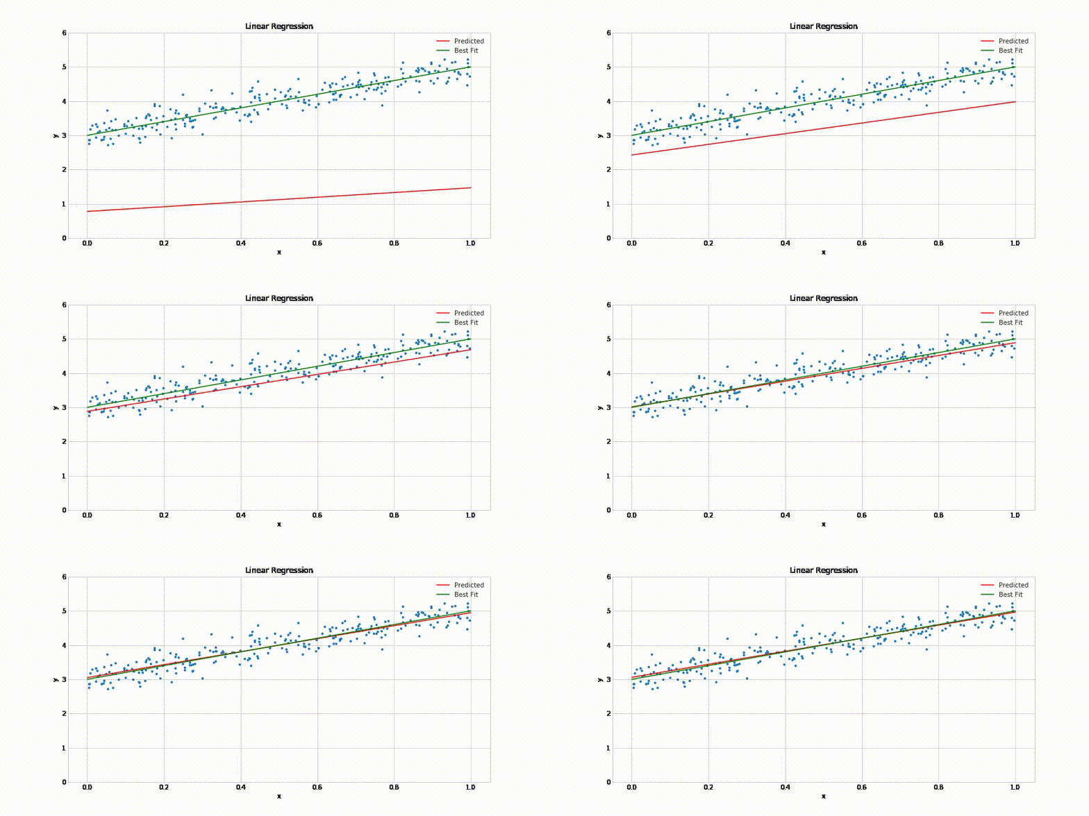
Doesn't it look similar to our own strategy of gradually moving the line closer to the points?
Linear Regression using Scikit-learn
In practice, you'll never need to implement either of the above methods yourself. You can use a library like scikit-learn to do this for you.
!pip install scikit-learn --quietLet's use the LinearRegression class from scikit-learn to find the best fit line for "age" vs. "charges" using the ordinary least squares optimization technique.
from sklearn.linear_model import LinearRegressionFirst, we create a new model object.
model = LinearRegression()Next, we can use the fit method of the model to find the best fit line for the inputs and targets.
help(model.fit)Help on method fit in module sklearn.linear_model._base:
fit(X, y, sample_weight=None) method of sklearn.linear_model._base.LinearRegression instance
Fit linear model.
Parameters
----------
X : {array-like, sparse matrix} of shape (n_samples, n_features)
Training data
y : array-like of shape (n_samples,) or (n_samples, n_targets)
Target values. Will be cast to X's dtype if necessary
sample_weight : array-like of shape (n_samples,), default=None
Individual weights for each sample
.. versionadded:: 0.17
parameter *sample_weight* support to LinearRegression.
Returns
-------
self : returns an instance of self.
Not that the input X must be a 2-d array, so we'll need to pass a dataframe, instead of a single column.
inputs = non_smoker_df[['age']]
targets = non_smoker_df.charges
print('inputs.shape :', inputs.shape)
print('targes.shape :', targets.shape)inputs.shape : (1064, 1)
targes.shape : (1064,)
Let's fit the model to the data.
model.fit(inputs, targets)LinearRegression()We can now make predictions using the model. Let's try predicting the charges for the ages 23, 37 and 61
model.predict(np.array([[23],
[37],
[61]]))array([ 4055.30443855, 7796.78921819, 14210.76312614])Do these values seem reasonable? Compare them with the scatter plot above.
Let compute the predictions for the entire set of inputs
predictions = model.predict(inputs)predictionsarray([2719.0598744 , 5391.54900271, 6727.79356686, ..., 2719.0598744 ,
2719.0598744 , 3520.80661289])Let's compute the RMSE loss to evaluate the model.
rmse(targets, predictions)4662.505766636395Seems like our prediction is off by $4000 on average, which is not too bad considering the fact that there are several outliers.
The parameters of the model are stored in the coef_ and intercept_ properties.
# w
model.coef_array([267.24891283])# b
model.intercept_-2091.4205565650864Are these parameters close to your best guesses?
Let's visualize the line created by the above parameters.
try_parameters(model.coef_, model.intercept_)RMSE Loss: 4662.505766636395

Indeed the line is quite close to the points. It is slightly above the cluster of points, because it's also trying to account for the outliers.
EXERCISE: Use the
SGDRegressorclass fromscikit-learnto train a model using the stochastic gradient descent technique. Make predictions and compute the loss. Do you see any difference in the result?
EXERCISE: Repeat the steps is this section to train a linear regression model to estimate medical charges for smokers. Visualize the targets and predictions, and compute the loss.
Machine Learning
Congratulations, you've just trained your first machine learning model! Machine learning is simply the process of computing the best parameters to model the relationship between some feature and targets.
Every machine learning problem has three components:
-
Model
-
Cost Function
-
Optimizer
We'll look at several examples of each of the above in future tutorials. Here's how the relationship between these three components can be visualized:
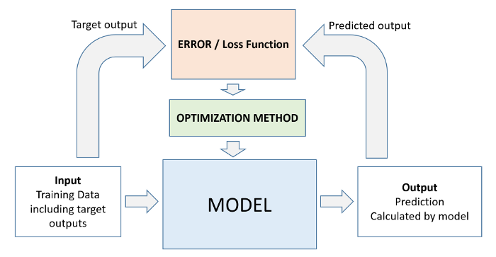
As we've seen above, it takes just a few lines of code to train a machine learning model using scikit-learn.
# Create inputs and targets
inputs, targets = non_smoker_df[['age']], non_smoker_df['charges']
# Create and train the model
model = LinearRegression().fit(inputs, targets)
# Generate predictions
predictions = model.predict(inputs)
# Compute loss to evalute the model
loss = rmse(targets, predictions)
print('Loss:', loss)Loss: 4662.505766636395
Linear Regression using Multiple Features
So far, we've used on the "age" feature to estimate "charges". Adding another feature like "bmi" is fairly straightforward. We simply assume the following relationship:
$charges = w_1 \times age + w_2 \times bmi + b$
We need to change just one line of code to include the BMI.
# Create inputs and targets
inputs, targets = non_smoker_df[['age', 'bmi']], non_smoker_df['charges']
# Create and train the model
model = LinearRegression().fit(inputs, targets)
# Generate predictions
predictions = model.predict(inputs)
# Compute loss to evalute the model
loss = rmse(targets, predictions)
print('Loss:', loss)Loss: 4662.3128354612945
As you can see, adding the BMI doesn't seem to reduce the loss by much, as the BMI has a very weak correlation with charges, especially for non smokers.
non_smoker_df.charges.corr(non_smoker_df.bmi)0.08403654312833268fig = px.scatter(non_smoker_df, x='bmi', y='charges', title='BMI vs. Charges')
fig.update_traces(marker_size=5)
fig.show()We can also visualize the relationship between all 3 variables "age", "bmi" and "charges" using a 3D scatter plot.
fig = px.scatter_3d(non_smoker_df, x='age', y='bmi', z='charges')
fig.update_traces(marker_size=3, marker_opacity=0.5)
fig.show()You can see that it's harder to interpret a 3D scatter plot compared to a 2D scatter plot. As we add more features, it becomes impossible to visualize all feature at once, which is why we use measures like correlation and loss.
Let's also check the parameters of the model.
model.coef_, model.intercept_(array([266.87657817, 7.07547666]), -2293.6320906488727)Clearly, BMI has a much lower weightage, and you can see why. It has a tiny contribution, and even that is probably accidental. This is an important thing to keep in mind: you can't find a relationship that doesn't exist, no matter what machine learning technique or optimization algorithm you apply.
EXERCISE: Train a linear regression model to estimate charges using BMI alone. Do you expect it to be better or worse than the previously trained models?
Let's go one step further, and add the final numeric column: "children", which seems to have some correlation with "charges".
$charges = w_1 \times age + w_2 \times bmi + w_3 \times charges + b$
non_smoker_df.charges.corr(non_smoker_df.children)0.13892870453542194fig = px.strip(non_smoker_df, x='children', y='charges', title= "Children vs. Charges")
fig.update_traces(marker_size=4, marker_opacity=0.7)
fig.show()# Create inputs and targets
inputs, targets = non_smoker_df[['age', 'bmi', 'children']], non_smoker_df['charges']
# Create and train the model
model = LinearRegression().fit(inputs, targets)
# Generate predictions
predictions = model.predict(inputs)
# Compute loss to evalute the model
loss = rmse(targets, predictions)
print('Loss:', loss)Loss: 4608.470405038246
Once again, we don't see a big reduction in the loss, even though it's greater than in the case of BMI.
EXERCISE: Repeat the steps is this section to train a linear regression model to estimate medical charges for smokers. Visualize the targets and predictions, and compute the loss.
EXERCISE: Repeat the steps is this section to train a linear regression model to estimate medical charges for all customers. Visualize the targets and predictions, and compute the loss. Is the loss lower or higher?
# Create inputs and targets
inputs, targets = medical_df[['age', 'bmi', 'children']], medical_df['charges']
# Create and train the model
model = LinearRegression().fit(inputs, targets)
# Generate predictions
predictions = model.predict(inputs)
# Compute loss to evalute the model
loss = rmse(targets, predictions)
print('Loss:', loss)Loss: 11355.317901125973
Using Categorical Features for Machine Learning
So far we've been using only numeric columns, since we can only perform computations with numbers. If we could use categorical columns like "smoker", we can train a single model for the entire dataset.
To use the categorical columns, we simply need to convert them to numbers. There are three common techniques for doing this:
- If a categorical column has just two categories (it's called a binary category), then we can replace their values with 0 and 1.
- If a categorical column has more than 2 categories, we can perform one-hot encoding i.e. create a new column for each category with 1s and 0s.
- If the categories have a natural order (e.g. cold, neutral, warm, hot), then they can be converted to numbers (e.g. 1, 2, 3, 4) preserving the order. These are called ordinals
Binary Categories
The "smoker" category has just two values "yes" and "no". Let's create a new column "smoker_code" containing 0 for "no" and 1 for "yes".
sns.barplot(data=medical_df, x='smoker', y='charges');
smoker_codes = {'no': 0, 'yes': 1}
medical_df['smoker_code'] = medical_df.smoker.map(smoker_codes)medical_df.charges.corr(medical_df.smoker_code)0.787251430498478medical_dfWe can now use the smoker_df column for linear regression.
$charges = w_1 \times age + w_2 \times bmi + w_3 \times charges + w_4 \times smoker + b$
# Create inputs and targets
inputs, targets = medical_df[['age', 'bmi', 'children', 'smoker_code']], medical_df['charges']
# Create and train the model
model = LinearRegression().fit(inputs, targets)
# Generate predictions
predictions = model.predict(inputs)
# Compute loss to evalute the model
loss = rmse(targets, predictions)
print('Loss:', loss)Loss: 6056.439217188081
The loss reduces from 11355 to 6056, almost by 50%! This is an important lesson: never ignore categorical data.
Let's try adding the "sex" column as well.
$charges = w_1 \times age + w_2 \times bmi + w_3 \times charges + w_4 \times smoker + w_5 \times sex + b$
sns.barplot(data=medical_df, x='sex', y='charges')<AxesSubplot:xlabel='sex', ylabel='charges'>
sex_codes = {'female': 0, 'male': 1}medical_df['sex_code'] = medical_df.sex.map(sex_codes)medical_df.charges.corr(medical_df.sex_code)0.057292062202025484# Create inputs and targets
inputs, targets = medical_df[['age', 'bmi', 'children', 'smoker_code', 'sex_code']], medical_df['charges']
# Create and train the model
model = LinearRegression().fit(inputs, targets)
# Generate predictions
predictions = model.predict(inputs)
# Compute loss to evalute the model
loss = rmse(targets, predictions)
print('Loss:', loss)Loss: 6056.100708754546
As you might expect, this does have a significant impact on the loss.
One-hot Encoding
The "region" column contains 4 values, so we'll need to use hot encoding and create a new column for each region.

sns.barplot(data=medical_df, x='region', y='charges');
from sklearn import preprocessing
enc = preprocessing.OneHotEncoder()
enc.fit(medical_df[['region']])
enc.categories_[array(['northeast', 'northwest', 'southeast', 'southwest'], dtype=object)]one_hot = enc.transform(medical_df[['region']]).toarray()
one_hotarray([[0., 0., 0., 1.],
[0., 0., 1., 0.],
[0., 0., 1., 0.],
...,
[0., 0., 1., 0.],
[0., 0., 0., 1.],
[0., 1., 0., 0.]])medical_df[['northeast', 'northwest', 'southeast', 'southwest']] = one_hotmedical_dfLet's include the region columns into our linear regression model.
$charges = w_1 \times age + w_2 \times bmi + w_3 \times charges + w_4 \times smoker + w_5 \times sex + w_6 \times region + b$
# Create inputs and targets
input_cols = ['age', 'bmi', 'children', 'smoker_code', 'sex_code', 'northeast', 'northwest', 'southeast', 'southwest']
inputs, targets = medical_df[input_cols], medical_df['charges']
# Create and train the model
model = LinearRegression().fit(inputs, targets)
# Generate predictions
predictions = model.predict(inputs)
# Compute loss to evalute the model
loss = rmse(targets, predictions)
print('Loss:', loss)Loss: 6041.6796511744515
Once again, this leads to a fairly small reduction in the loss.
EXERCISE: Are two separate linear regression models, one for smokers and one of non-smokers, better than a single linear regression model? Why or why not? Try it out and see if you can justify your answer with data.
Model Improvements
Let's discuss and apply some more improvements to our model.
Feature Scaling
Recall that due to regulatory requirements, we also need to explain the rationale behind the predictions our model.
$charges = w_1 \times age + w_2 \times bmi + w_3 \times charges + w_4 \times smoker + w_5 \times sex + w_6 \times region + b$
To compare the importance of each feature in the model, our first instinct might be to compare their weights.
model.coef_array([ 256.85635254, 339.19345361, 475.50054515, 23848.53454191,
-131.3143594 , 587.00923503, 234.0453356 , -448.01281436,
-373.04175627])model.intercept_-12525.547811195444weights_df = pd.DataFrame({
'feature': np.append(input_cols, 1),
'weight': np.append(model.coef_, model.intercept_)
})
weights_dfWhile it seems like BMI and the "northeast" have a higher weight than age, keep in mind that the range of values for BMI is limited (15 to 40) and the "northeast" column only takes the values 0 and 1.
Because different columns have different ranges, we run into two issues:
- We can't compare the weights of different column to identify which features are important
- A column with a larger range of inputs may disproportionately affect the loss and dominate the optimization process.
For this reason, it's common practice to scale (or standardize) the values in numeric column by subtracting the mean and dividing by the standard deviation.

We can apply scaling using the StandardScaler class from scikit-learn.
medical_dffrom sklearn.preprocessing import StandardScalernumeric_cols = ['age', 'bmi', 'children']
scaler = StandardScaler()
scaler.fit(medical_df[numeric_cols])StandardScaler()scaler.mean_array([39.20702541, 30.66339686, 1.09491779])scaler.var_array([197.25385199, 37.16008997, 1.45212664])We can now scale data as follows:
scaled_inputs = scaler.transform(medical_df[numeric_cols])
scaled_inputsarray([[-1.43876426, -0.45332 , -0.90861367],
[-1.50996545, 0.5096211 , -0.07876719],
[-0.79795355, 0.38330685, 1.58092576],
...,
[-1.50996545, 1.0148781 , -0.90861367],
[-1.29636188, -0.79781341, -0.90861367],
[ 1.55168573, -0.26138796, -0.90861367]])These can now we combined with the categorical data
cat_cols = ['smoker_code', 'sex_code', 'northeast', 'northwest', 'southeast', 'southwest']
categorical_data = medical_df[cat_cols].valuesinputs = np.concatenate((scaled_inputs, categorical_data), axis=1)
targets = medical_df.charges
# Create and train the model
model = LinearRegression().fit(inputs, targets)
# Generate predictions
predictions = model.predict(inputs)
# Compute loss to evalute the model
loss = rmse(targets, predictions)
print('Loss:', loss)Loss: 6041.6796511744515
We can now compare the weights in the formula:
$charges = w_1 \times age + w_2 \times bmi + w_3 \times charges + w_4 \times smoker + w_5 \times sex + w_6 \times region + b$
weights_df = pd.DataFrame({
'feature': np.append(numeric_cols + cat_cols, 1),
'weight': np.append(model.coef_, model.intercept_)
})
weights_df.sort_values('weight', ascending=False)As you can see now, the most important feature are:
- Smoker
- Age
- BMI
Creating a Test Set
Models like the one we've created in this tutorial are designed to be used in the real world. It's common practice to set aside a small fraction of the data (e.g. 10%) just for testing and reporting the results of the model.
from sklearn.model_selection import train_test_splitinputs_train, inputs_test, targets_train, targets_test = train_test_split(inputs, targets, test_size=0.1)# Create and train the model
model = LinearRegression().fit(inputs_train, targets_train)
# Generate predictions
predictions_test = model.predict(inputs_test)
# Compute loss to evalute the model
loss = rmse(targets_test, predictions_test)
print('Test Loss:', loss)Test Loss: 6632.773342319344
Let's compare this with the training loss.
# Generate predictions
predictions_train = model.predict(inputs_train)
# Compute loss to evalute the model
loss = rmse(targets_train, predictions_train)
print('Training Loss:', loss)Training Loss: 5974.81480318593
Can you explain why the training loss is lower than the test loss? We'll discuss this in a lot more detail in future tutorials.
How to Approach a Machine Learning Problem
Here's a strategy you can apply to approach any machine learning problem:
- Explore the data and find correlations between inputs and targets
- Pick the right model, loss functions and optimizer for the problem at hand
- Scale numeric variables and one-hot encode categorical data
- Set aside a test set (using a fraction of the training set)
- Train the model
- Make predictions on the test set and compute the loss
We'll apply this process to several problems in future tutorials.
Summary and Further Reading
We've covered the following topics in this tutorial:
- A typical problem statement for machine learning
- Downloading and exploring a dataset for machine learning
- Linear regression with one variable using Scikit-learn
- Linear regression with multiple variables
- Using categorical features for machine learning
- Regression coefficients and feature importance
- Creating a training and test set for reporting results
Apply the techniques covered in this tutorial to the following datasets:
- https://www.kaggle.com/vikrishnan/boston-house-prices
- https://www.kaggle.com/sohier/calcofi
- https://www.kaggle.com/budincsevity/szeged-weather
Check out the following links to learn more about linear regression: